I went to watch Frozen II last week. Even though not quite get the story, I was really impressed by Elsa and Anna’s outfits. I particularly love Anna’s travel outfit, which is consisted of midi skirts, capes, and boot.
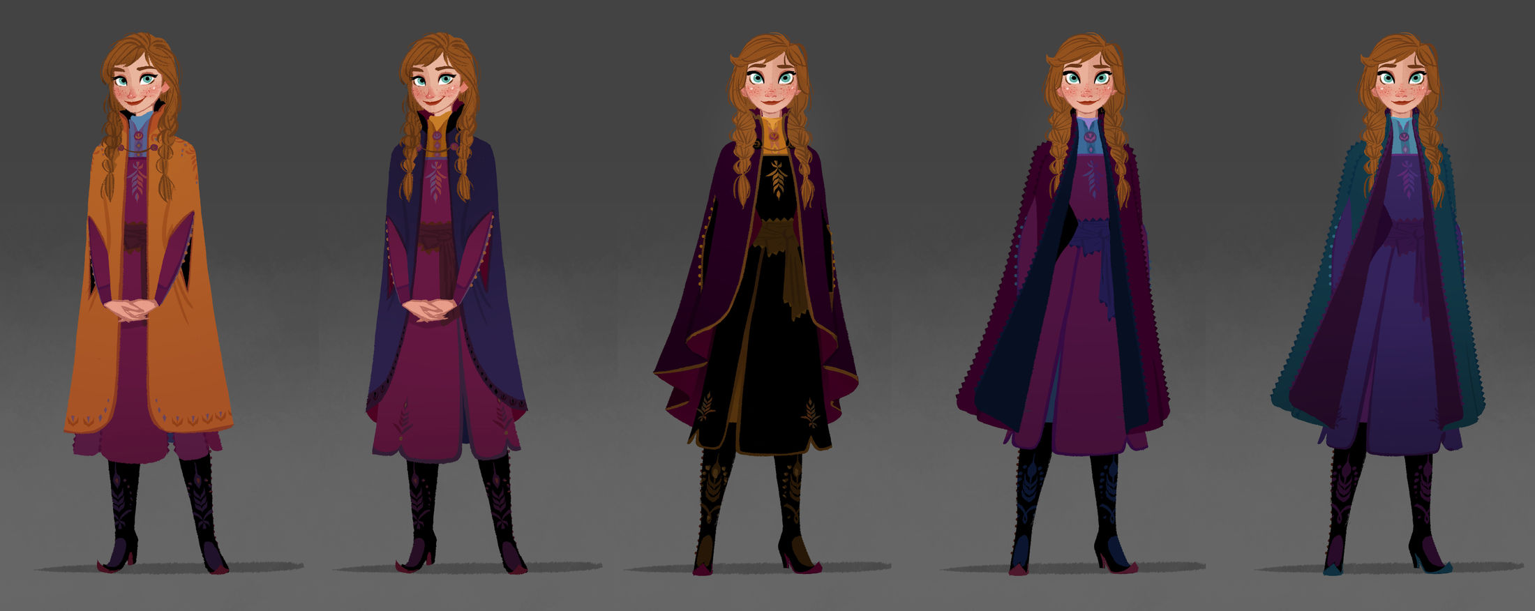
FROZEN 2 – Visual Development Art by Griselda Sastrawinata – Visual Development Artist. © 2019 Disney
“Anna’s style draws inspiration from traditional Norwegian folk wear known as the bunad, a dress typically made out of wool and adorned with embroidery, and silhouettes like the cinched waist and full, A-line skirt from Christian Dior’s “New Look.” Her looks tend to be grounded in the fabrics and materials of the place and time period (the 1840s-1850s, according to Lee), which means she wears heavier materials like wool and velvet and her color palette skews on the warmer side.”
– Vox (https://www.vox.com/the-goods/2019/11/18/20970465/frozen-2-costumes-design-animate-anna-elsa)
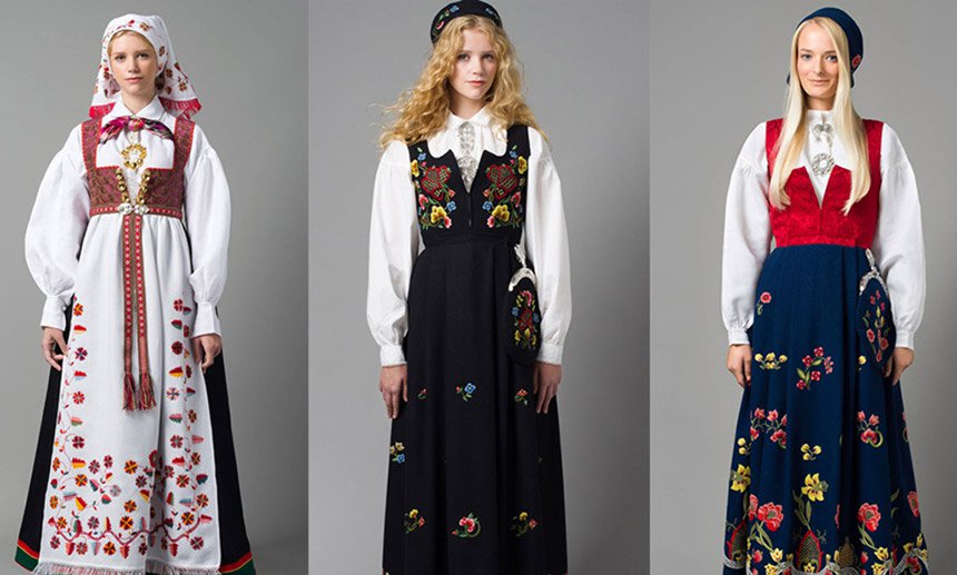
The Norwegian Bunad 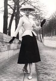
Christian Dior’s ‘New Look’ 1947
In Frozen II Anna has grown three years older and has become more mature, which is reflected in her hairstyles and dresses. Her hair changed from pigtail braids to something less childish: half of her hair is down and a crown braid runs across the back of her head. In terms of Anna’s costume, its lines have become more straightened, and the overall color palette changed into something darker and less saturated.
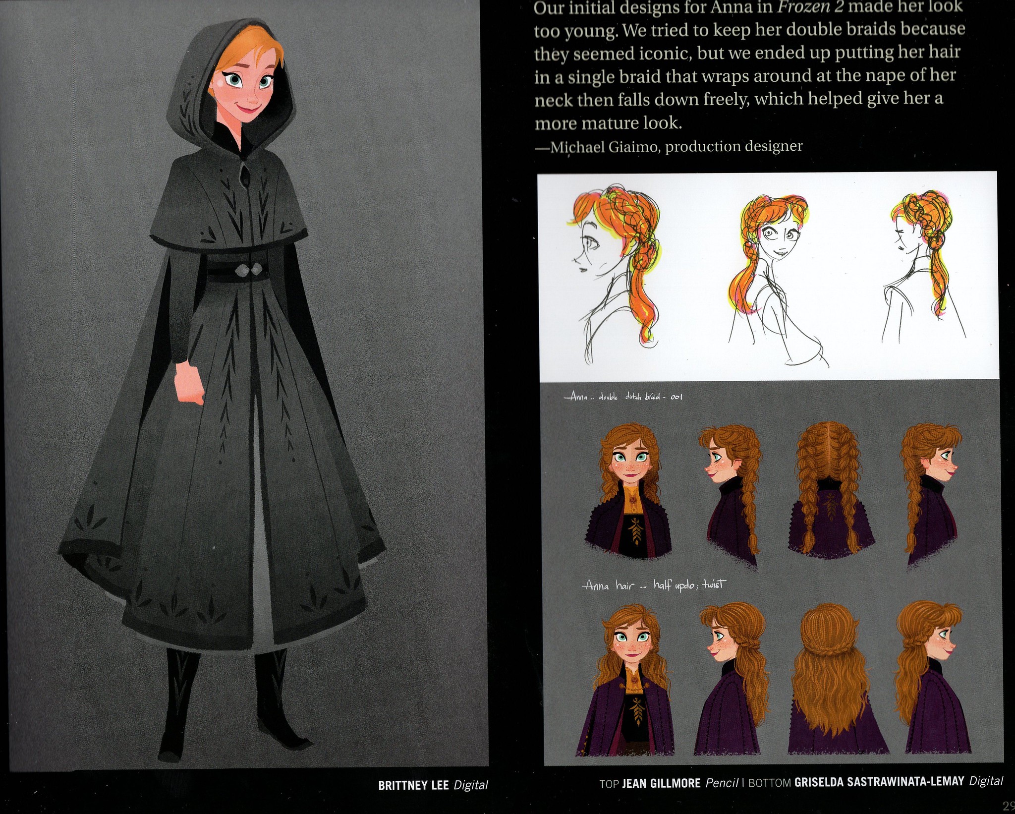
Anna’s hairstyle change. Source: http://www.youloveit.com/cartoons/990-frozen-2-annas-outfits-concept-art-including-new-arendelle-queen-dress-from-final.html
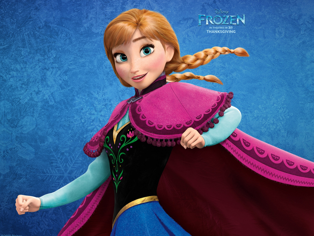
Anna in Frozen I 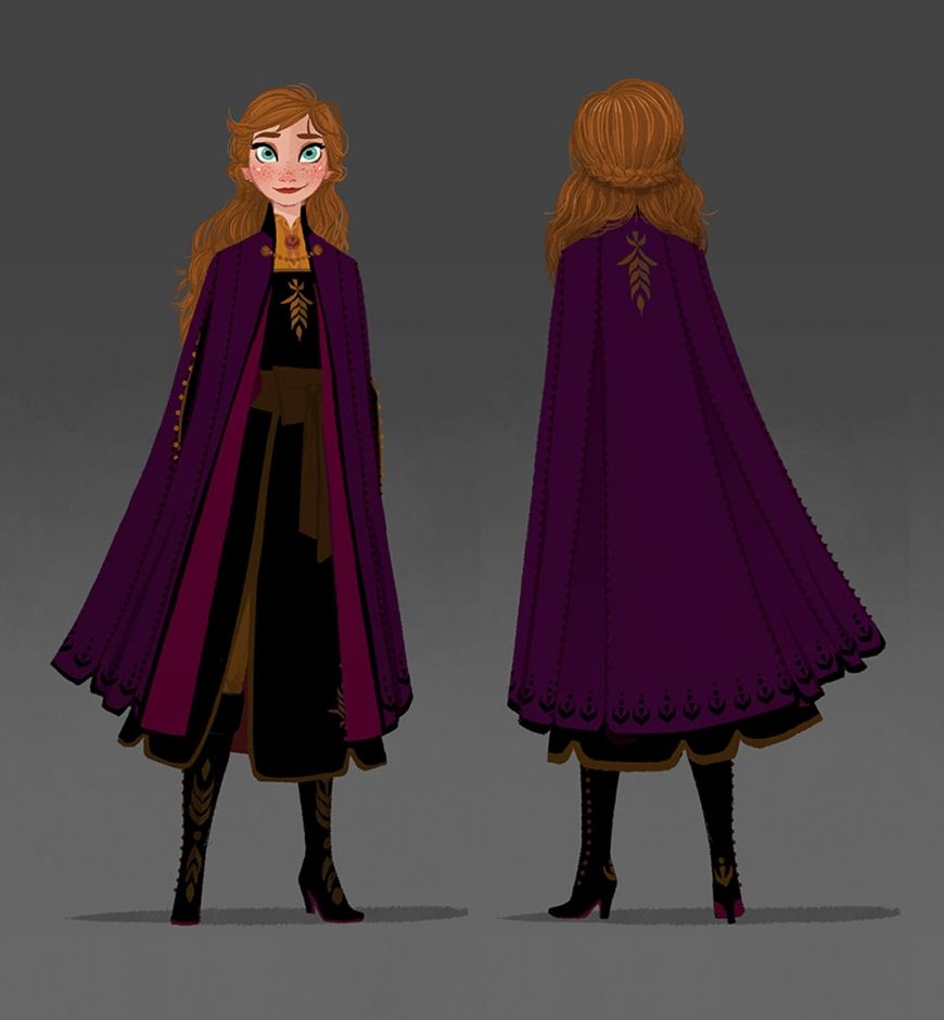
Anna in Frozen II
The change of the cape color from bright pink to darker pink/purple is what I think the most successful. Especially when the new pink/purple color is in contrast with a touch of the gold color around her necks, it really showcases Anna’s identity as a royal princess. Besides, the less saturated pink is also a better match for her beautiful auburn hair. Compared with Frozen I, the dresses in Frozen II become shortened, therefore making it easier for the sisters to run, jump, and climb in the magic forest. Both Anna and Elsa are wearing pants and boots underneath their skirts, which is another improvement from Frozen I for their constant movements.
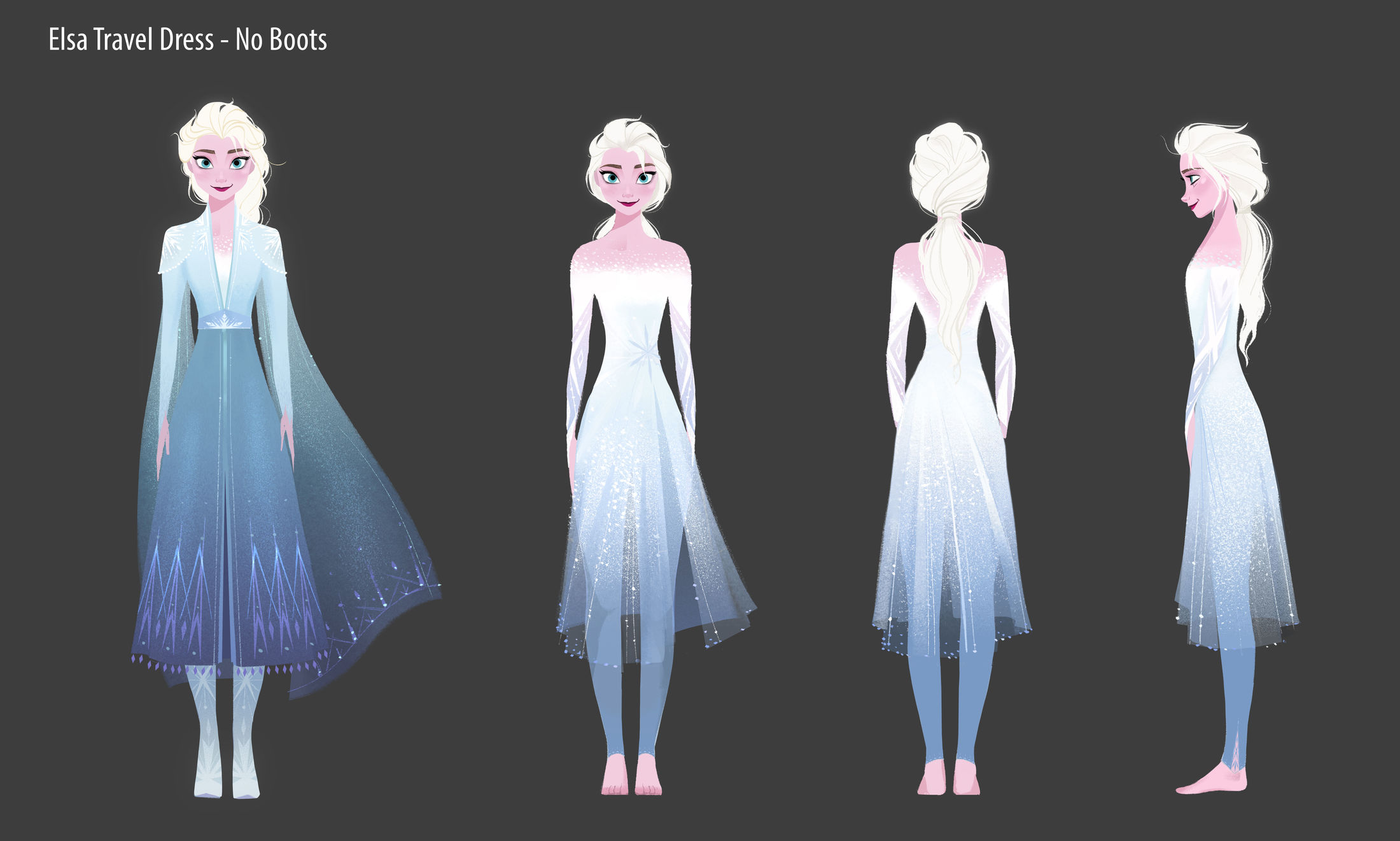
For Elsa, her dressing style and color is mostly inherited from the last movie. While keeping the theme color of white and light blue that remains people her magic power related to ice, the new dress has a bit more military look with the encrusted shoulders. The change is reflecting her new identity as the Queue of Arendelle.
FROZEN 2 – Visual Development Art by Brittney Lee – Visual Development Artist. © 2019 Disney
Similarly, after Anna becomes the new Queue of Arendelle her dress also changed from last season while keeping the green color scheme.
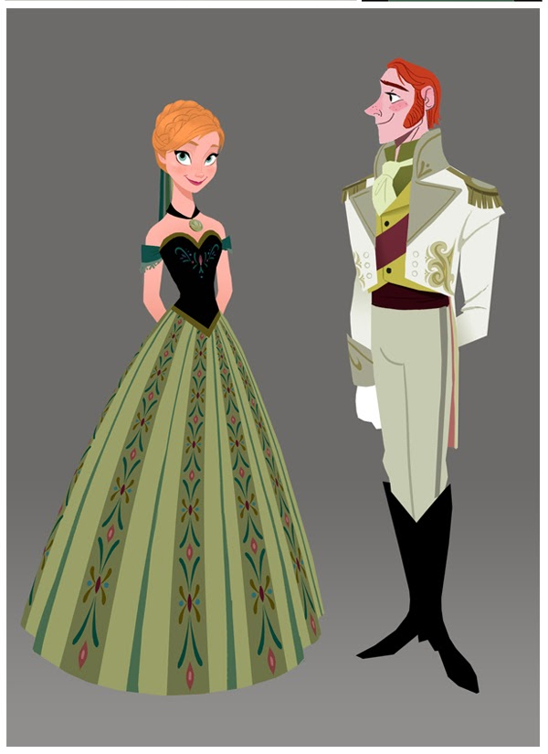
Frozen, Anna and Hans ball costumes 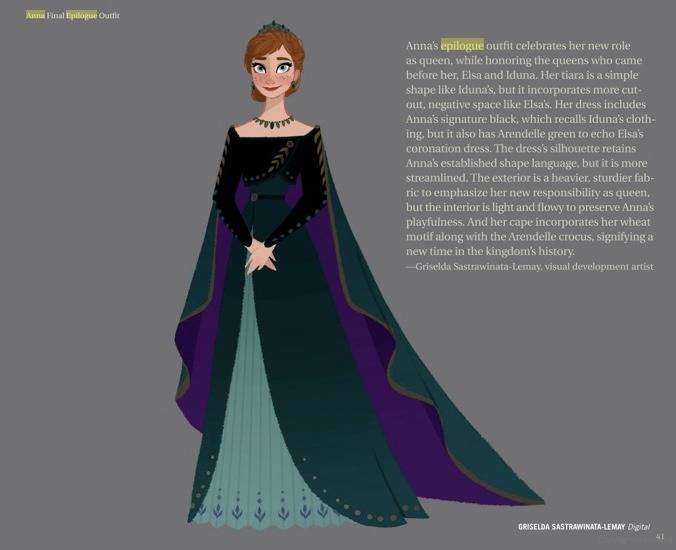
Frozen II, Anna celebration dress after becoming the Queen
After taking her cape and boots off, Elsa’s outfit really remains me of the costume of figure skating, and the legging makes sure she can move freely without being worried about too much exposure. Besides, there is also a lot of discussion about the fabric of Elsa’s dress, so that it could perform realistically when she is flighting with Nokk underwater.
At the end of the movie, Elsa finally reached the Ahtohallan, where her dress changed again while her understanding of her role and responsibility has changed. (And there is actually a transforming process as what you have in Sailor Moon lol ) Elsa finally got a white dress that I think everything little girl would be crazy about.
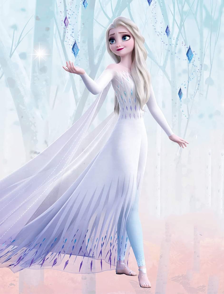
Frozen II. Elsa’s show yourself dress 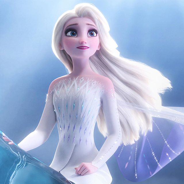
Frozen II. Elsa’s show yourself dress
We can see the color scheme is still derived from ice, and the decorations are referring to the four elements appeared in the movie before. With the transparent white cape and the water horse, Elsa looks more like a fairy or goddess instead of a queen.
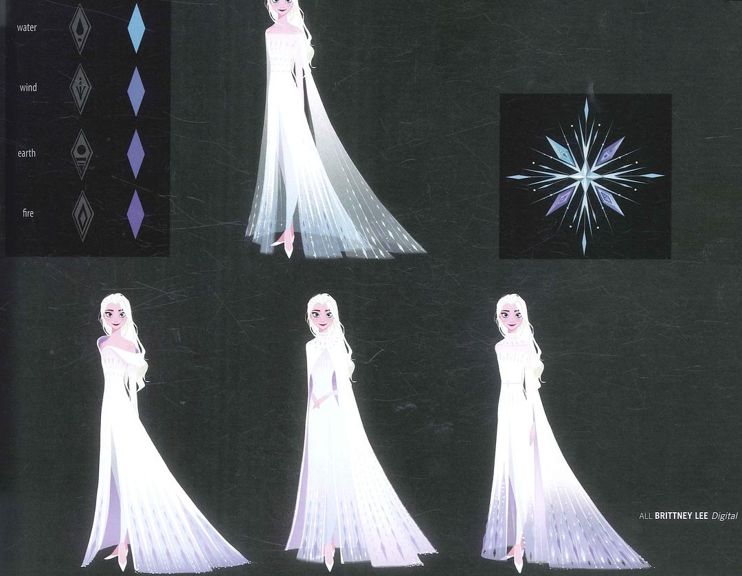
Elsa’s costume concept design. By Brittney Lee Digital
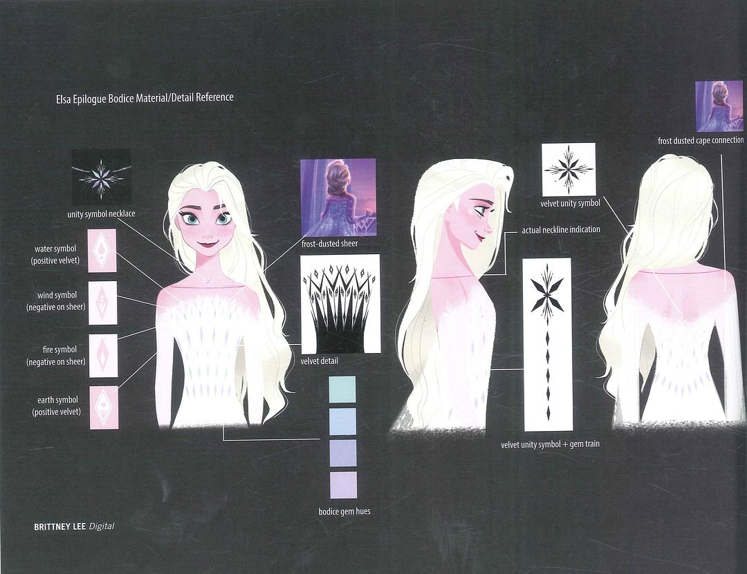
Elsa’s costume concept design. By Brittney Lee Digital
References:
- 《冰雪奇缘2》幕后揭秘: https://movie.douban.com/subject/25887288/
- Costume design for animated movies is ridiculously difficult. The team behind Frozen 2 explains why: https://www.vox.com/the-goods/2019/11/18/20970465/frozen-2-costumes-design-animate-anna-elsa
- Costume Design in Animation – Disney’s Frozen: http://tyrannyofstyle.com/costume-design-animation-disney-frozen
- THE EVOLUTION OF ANNA AND ELSA, FROM FROZEN TO FROZEN II: https://www.syfy.com/syfywire/the-evolution-of-anna-and-elsa-from-frozen-to-frozen-ii
- How ‘Frozen’ Transformed Princesses to Caped Crusaders in Sequel: https://www.hollywoodreporter.com/behind-screen/how-frozen-sisters-transformed-princesses-caped-crusaders-sequel-1257252
- Frozen 2 Anna’s outfits concept art, including new Arendelle Queen dress from final: http://www.youloveit.com/cartoons/990-frozen-2-annas-outfits-concept-art-including-new-arendelle-queen-dress-from-final.html